Concise & Professional
Goal
Our objective was to design a user experience that is entirely intuitive, requiring no explanation or training. From the outset, users can seamlessly create unique research criteria and generate customized, data-rich reports with ease.
Relevance
Data resources of sufficient scale to support global disease statistics are not easily deployed. To enable the proposed functionality and data flow, extensive data cleansing and structuring were essential preparation steps. Our approach to developing effective data visualization is grounded in a deep understanding of the total dataset, the specific data types involved, and their relevance to the pharmaceutical industry.
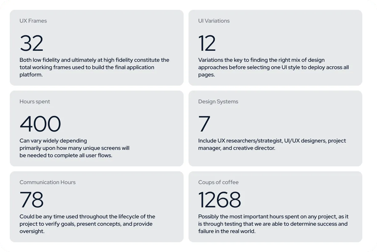
The Numbers
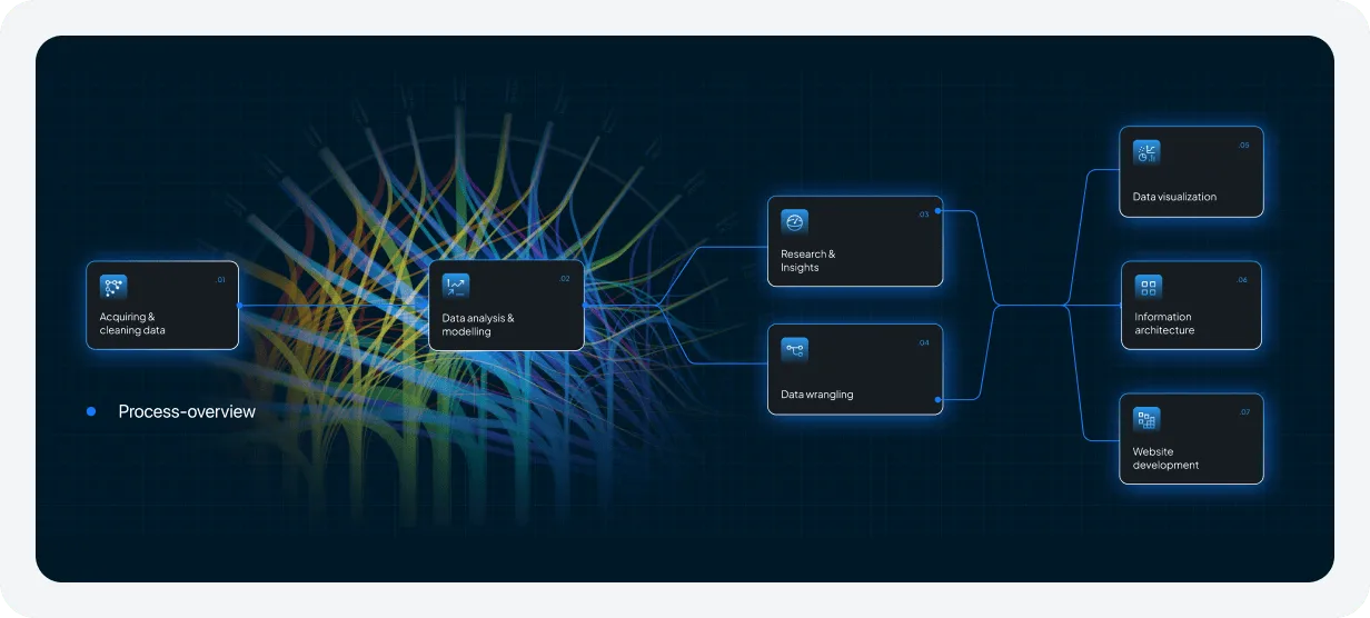
This provides an overview of the intricate process involved in designing and deploying an application of such data density, rich embedded functionality, and extensive utility.
Overview
The final UI design represents the culmination of extensive research, rigorous usability testing, the development of hundreds of user stories, and strict adherence to corporate standards and brand guidelines.
Header
Header design demands highly human-centered and intuitive strategies, as it serves as the primary navigation hub for the entire application, consistently guiding users across every screen within the platform.
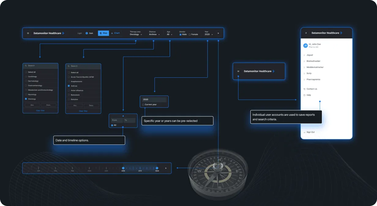
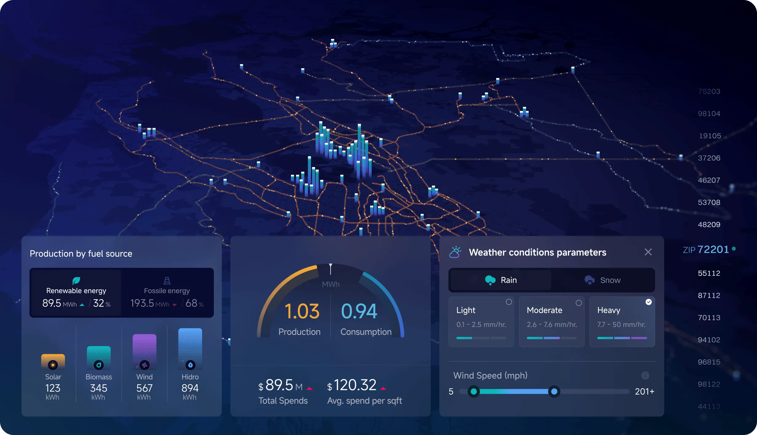
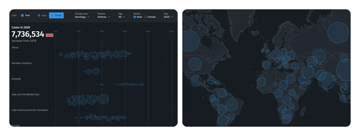
Map/Chart
High-level map data visualizations were created to provide users with an initial point of orientation, helping them understand the broader possibilities within the dataset. These visualizations serve as a starting framework, enabling users to explore further and apply the necessary data filters to achieve their specific objectives.
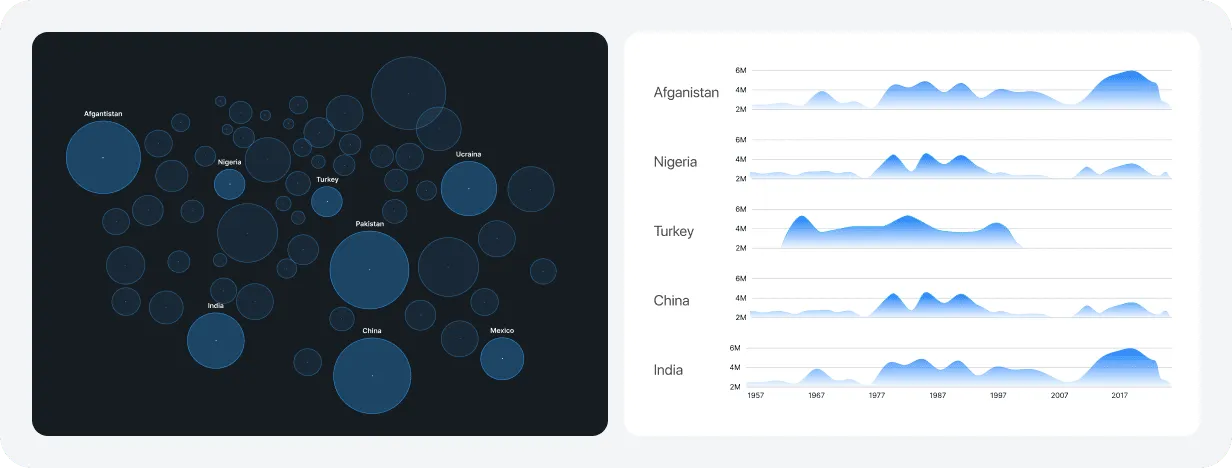
Sankey Chart
A Sankey diagram was developed to provide users with a comprehensive overview of the data, while also enabling country-level exploration for more detailed insights.

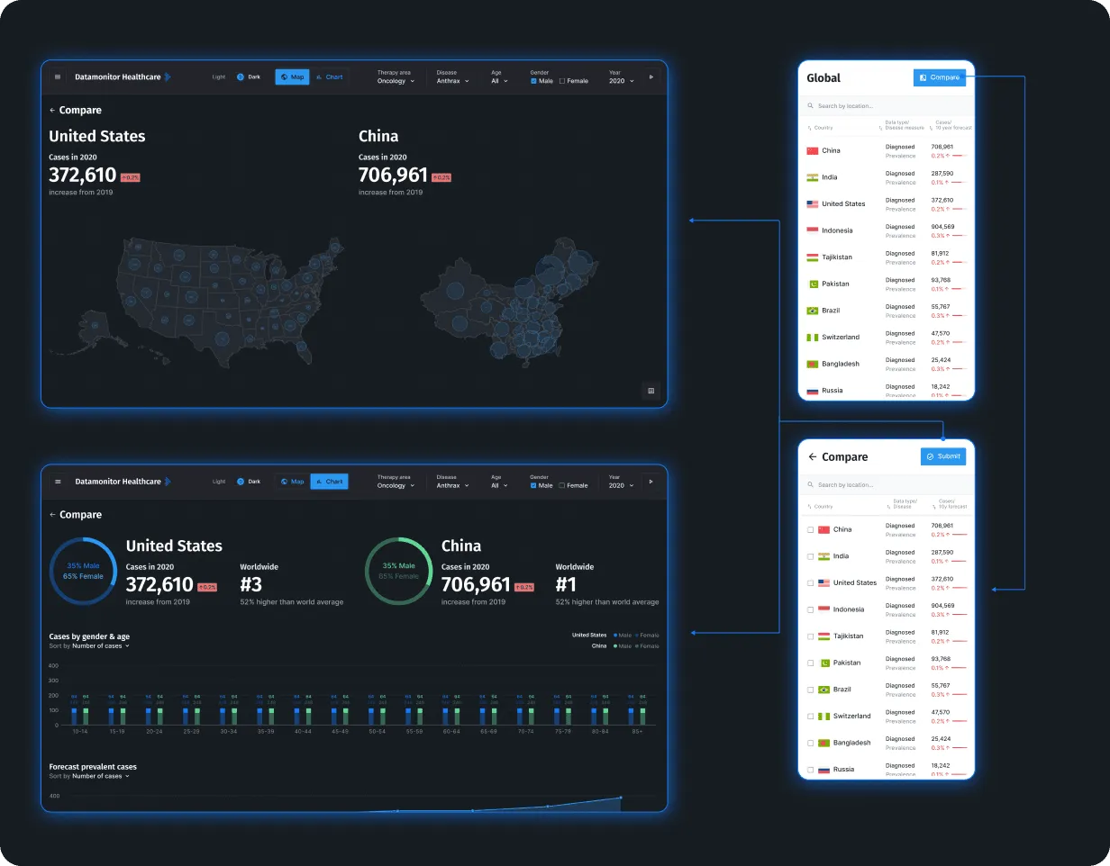
Compare
The primary deliverable of our Datamonitor design lies in empowering users to customize data selections and conduct comparisons aligned with their specific objectives.
Research and analysis
Often, the efficacy of data visualization is enhanced by its simplicity. This particular view enables users to rapidly identify regions with the highest incidence of specific diseases, thereby facilitating deeper exploration into country-specific data for further detailed analysis.
Country Statistics
Country-level data represents only the initial layer of exploration, as users can further compare information across states, cities, and counties. After selecting a specific region, users may refine their analysis by applying timeframe filters, adding another dimension of insight and establishing a foundation for future data projections.