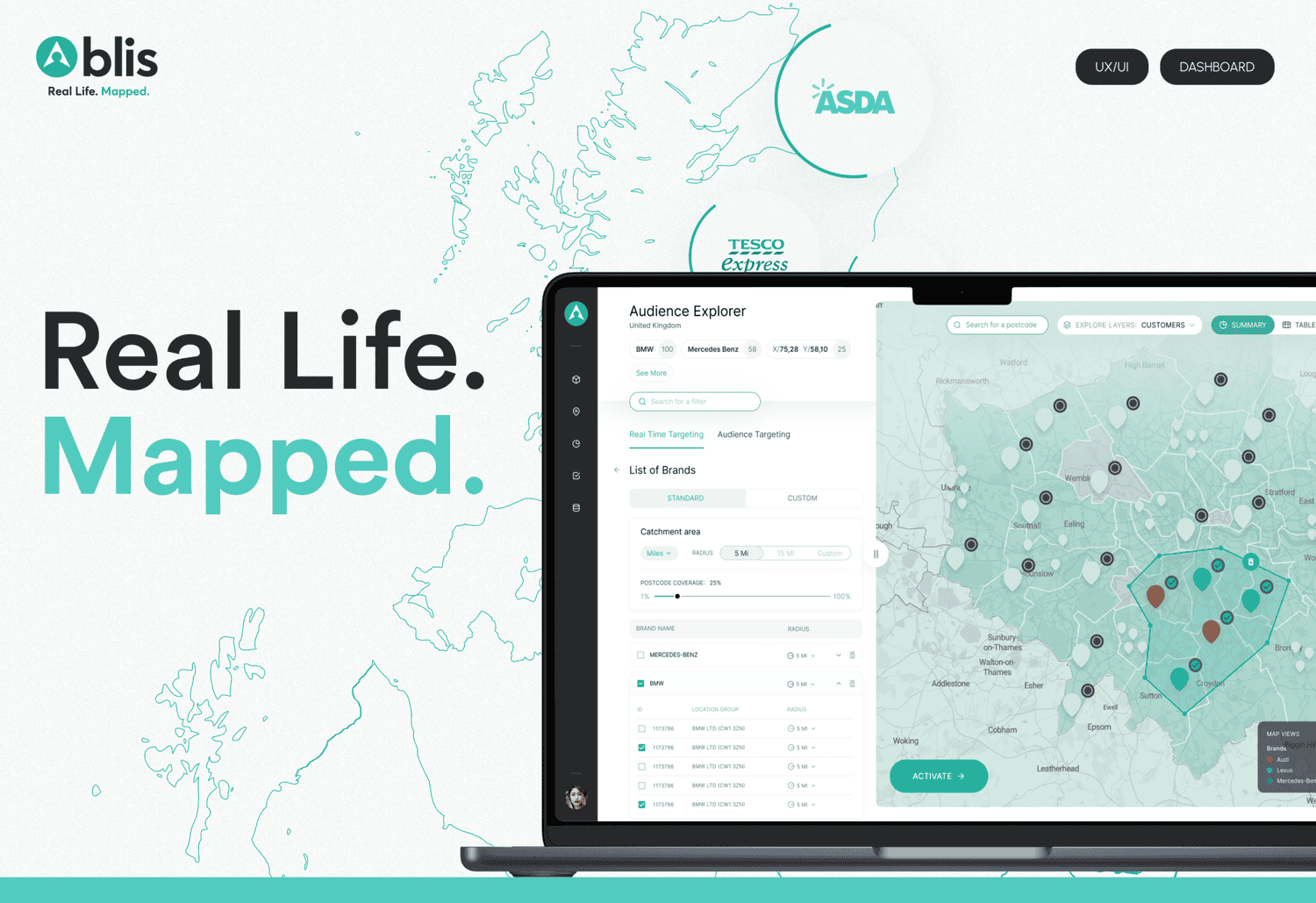

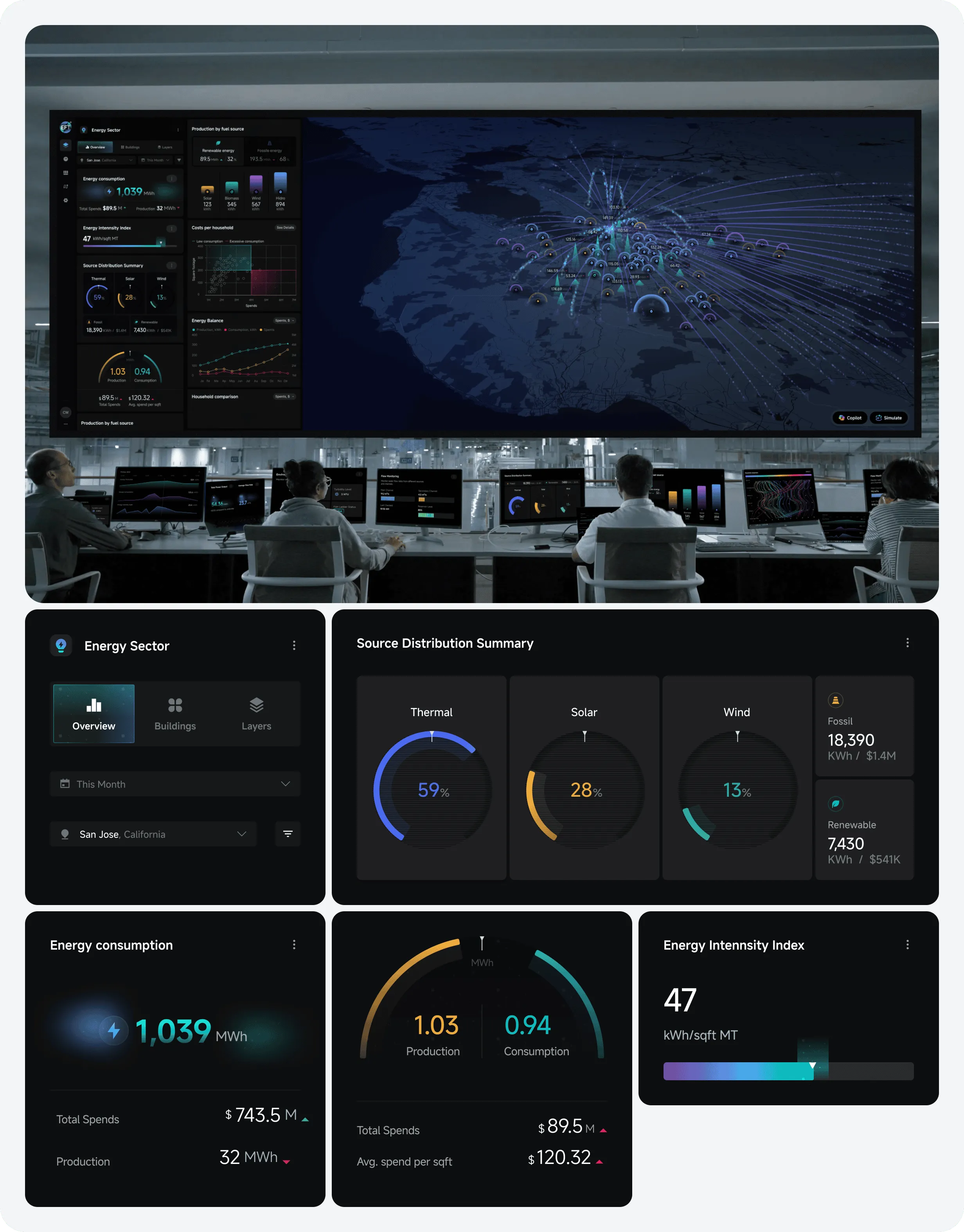
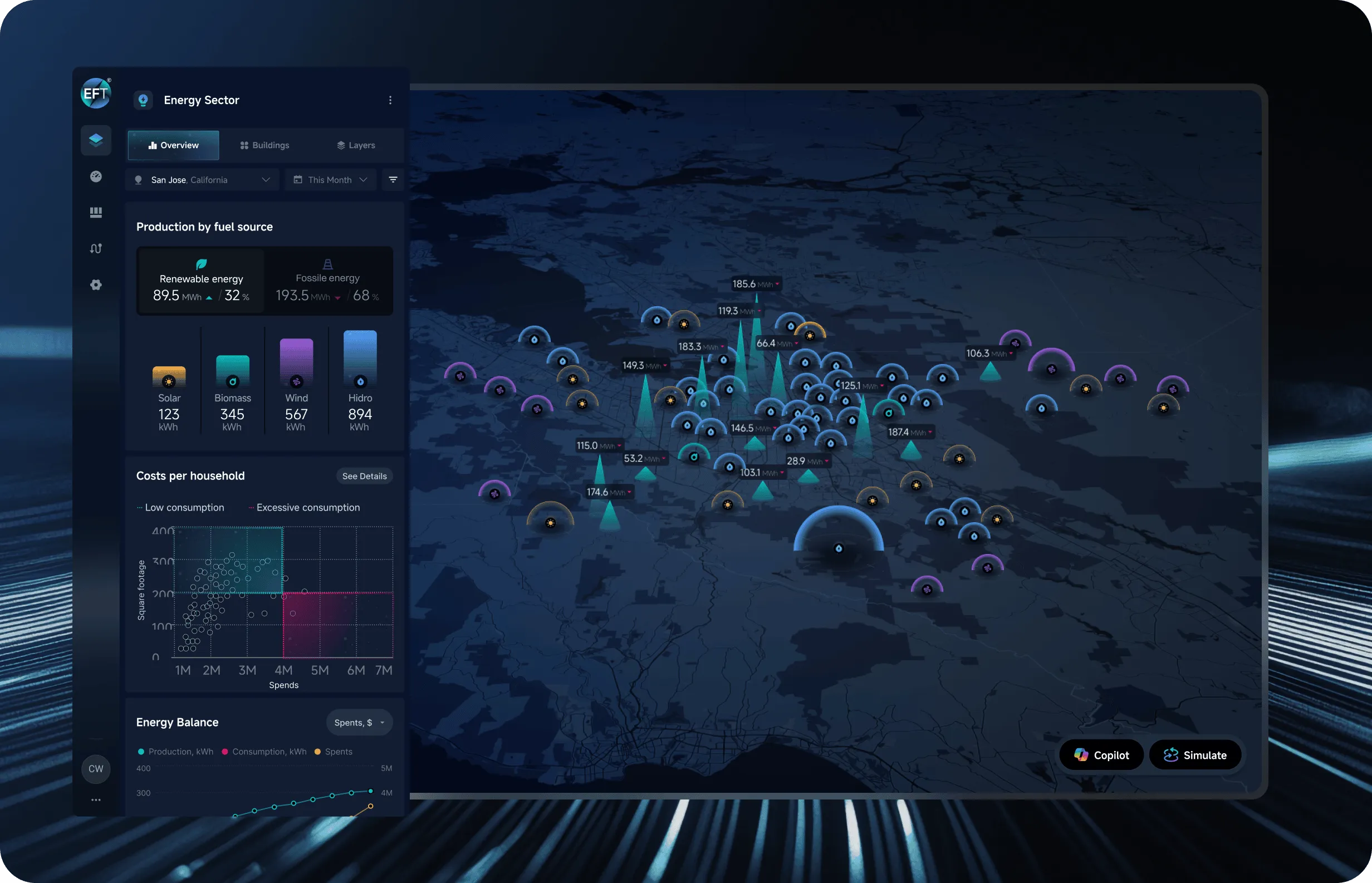
Project Overview
EffiTrack is designed to be a leading energy monitoring dashboard system available today. Each interface allows users to leverage this data visualization platform to observe, track, and assess energy usage through various metrics. From overarching trends to specific building performance, EffiTrack equips decision-makers with practical insights to enhance energy efficiency and promote sustainability.
Energizing the World: A Brief Insight
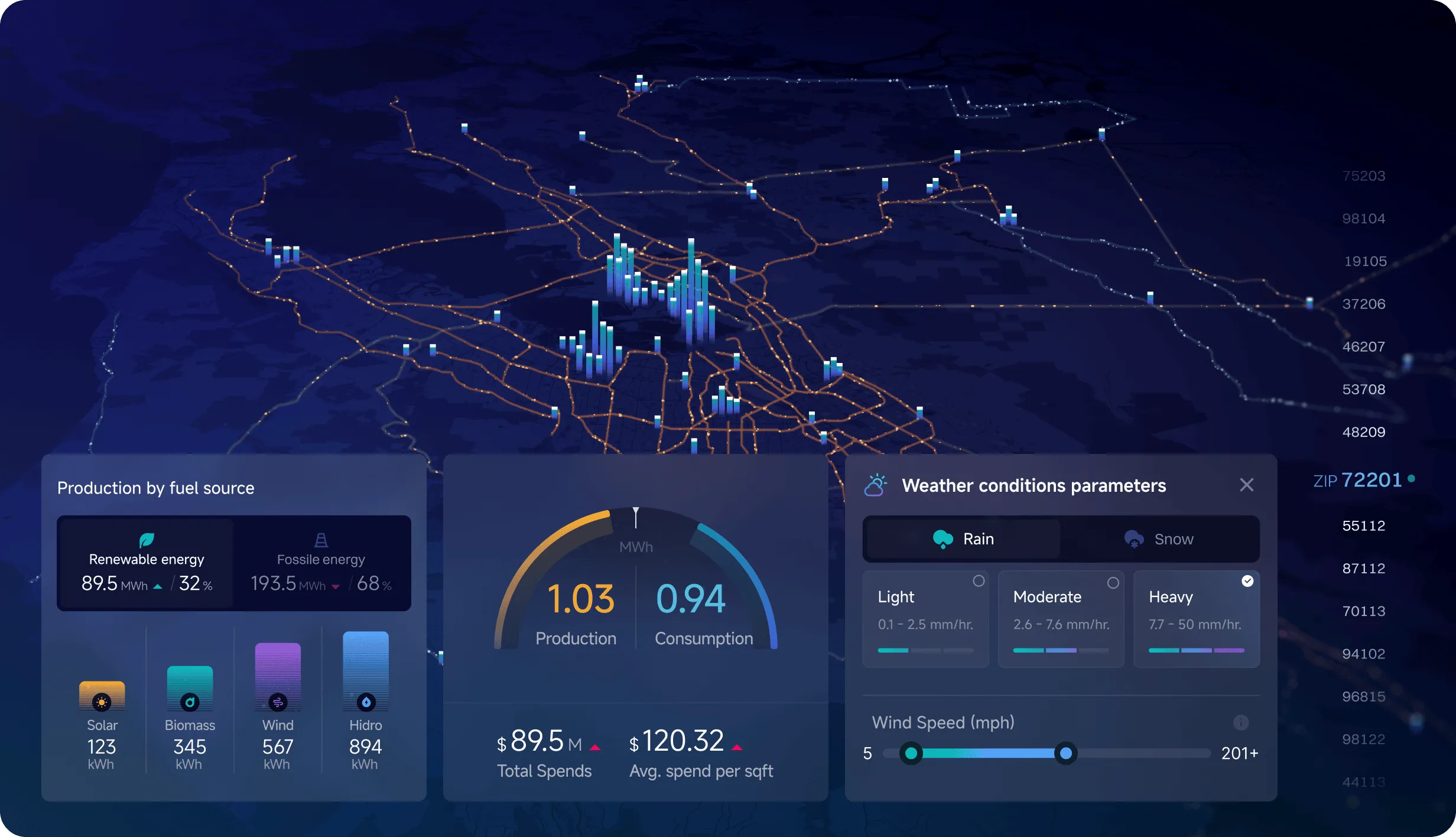
Delve into the intricacies of energy consumption at the local level. The Mapping Energy: Area Analysis tool offers engaging visualizations and essential metrics to pinpoint hotspots, compare different regions, and evaluate the effectiveness of energy distribution using data visualization for energy networks.
Energy Mapping and Area Assessment
Discover localized insights into energy consumption and resource allocation with Mapping Energy: Area Analysis. This module showcases the unique dynamics of different areas, uncovering trends in urban and rural settings, the effects of infrastructure, and chances to enhance energy efficiency. By focusing on specific regions, users can make informed decisions that cater to local energy requirements, supported by real-time efficiency data visualizations!
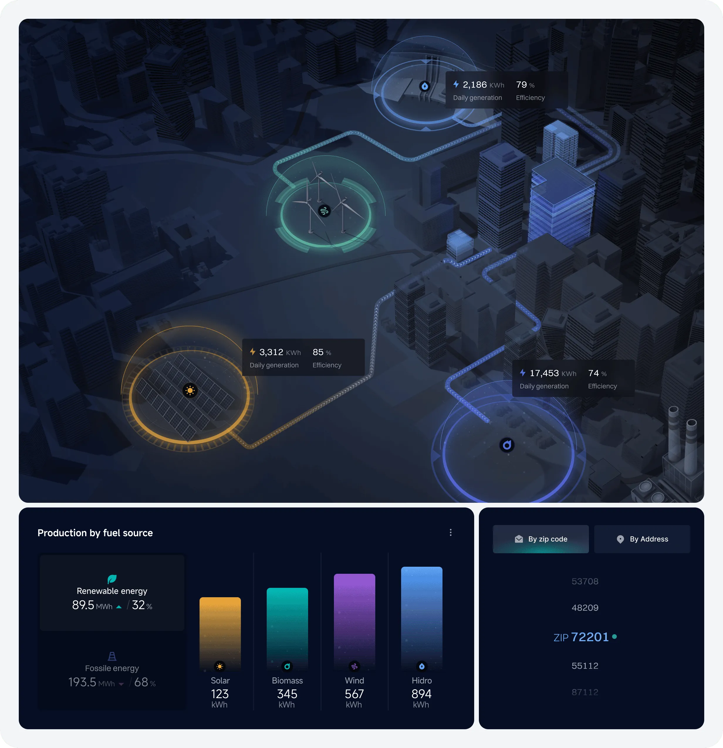
Discovering Connections Across the Country
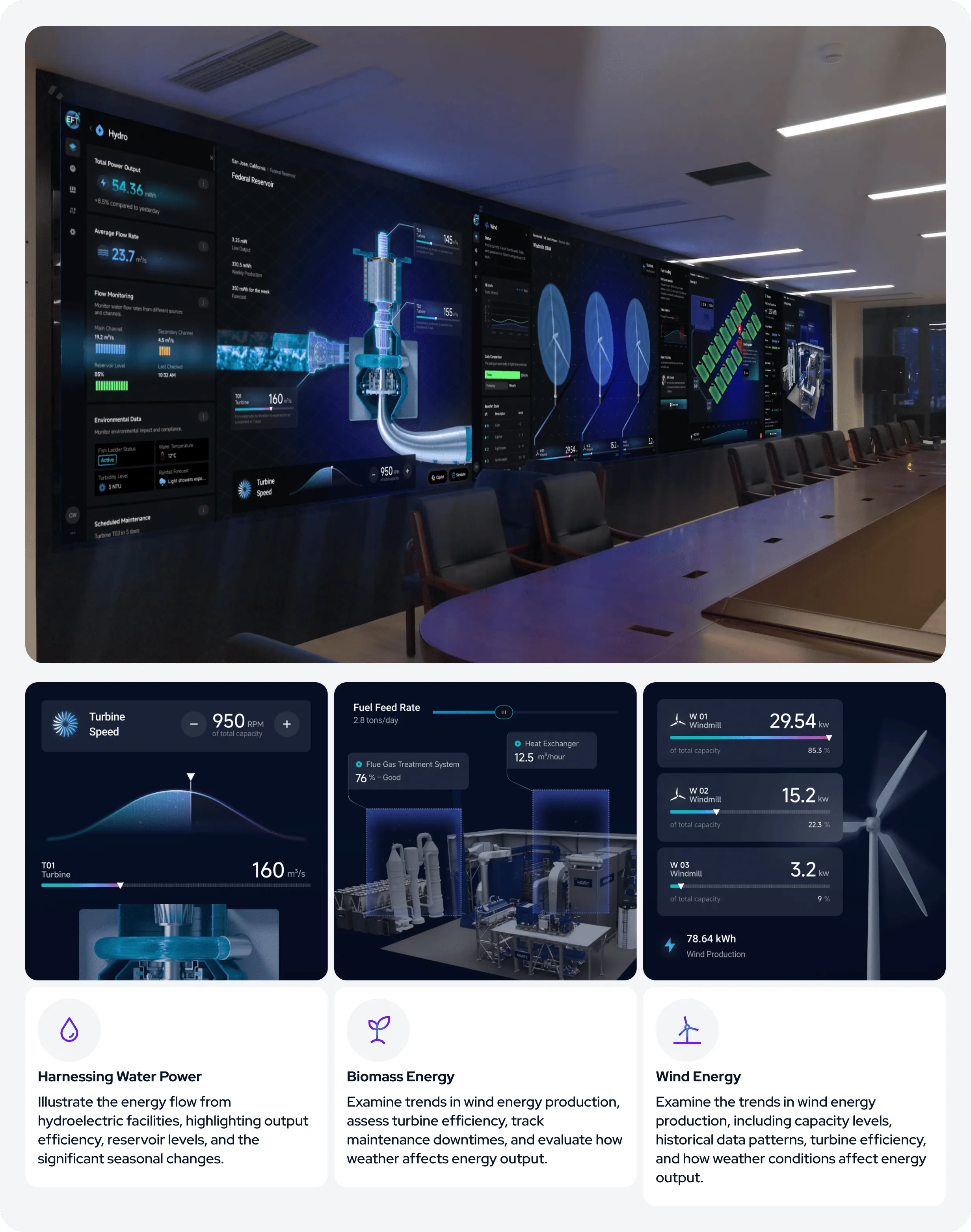
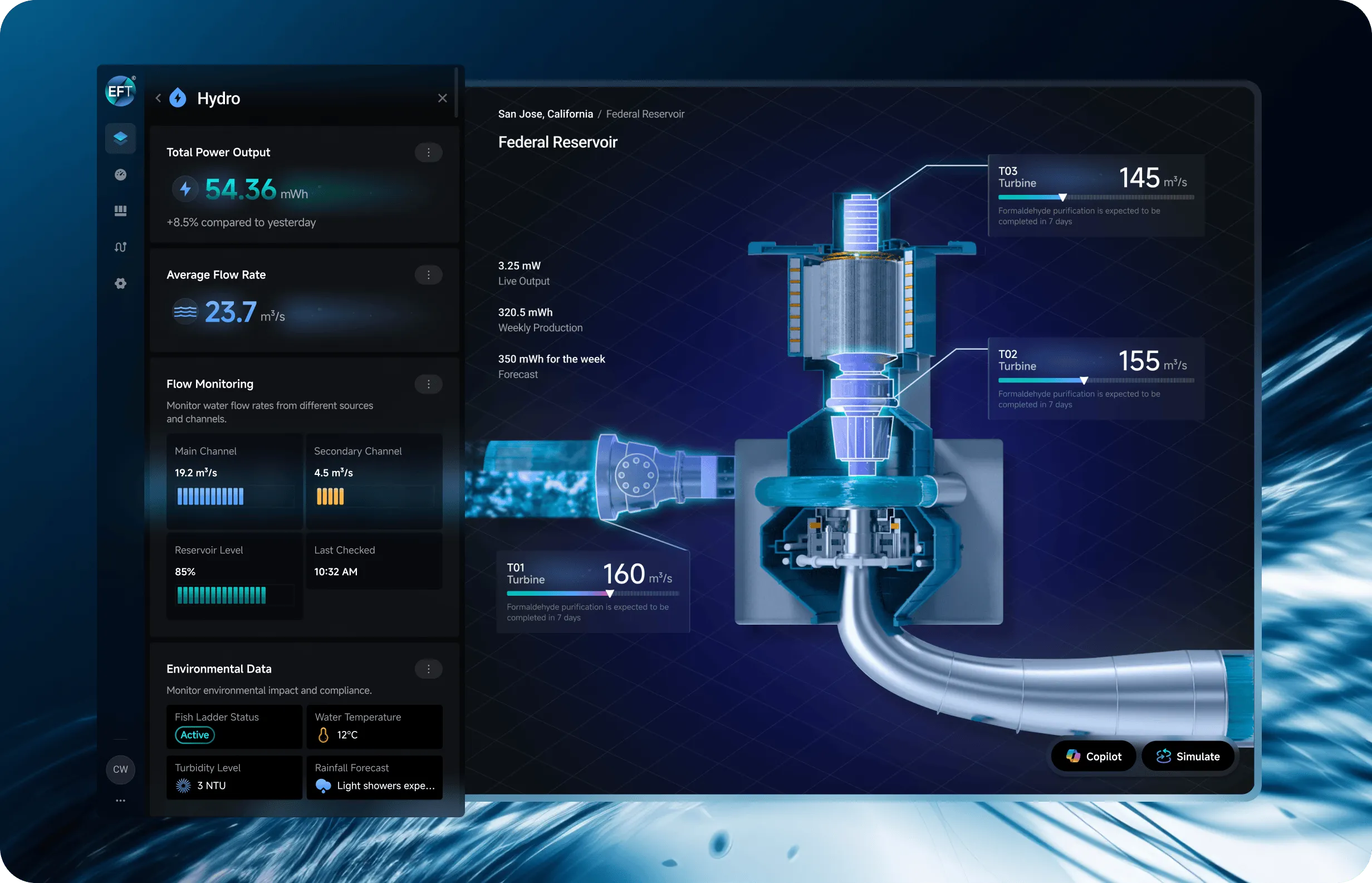
Discover the varied world of renewable energy through our Power Spectrum display. Learn about the distinct features of hydro, wind, solar, and bioenergy, and their impact on promoting sustainability and reshaping the global energy landscape. Engaging visuals illustrate how these energy sources aid in achieving global decarbonization targets, as nations, regions, and local governments collaborate to build a more sustainable future for everyone.
Energy Sources: Hydropower, Wind, Solar & Biomass
Discover the varied world of renewable energy through The Power Spectrum. Dive into the distinct features of hydro, wind, solar, and bioenergy, learning about their contributions, potential, and how we can effectively harness these sources to promote sustainability and enhance the global energy landscape. The interactive visuals below illustrate how these energy types can significantly aid our efforts in decarbonization.
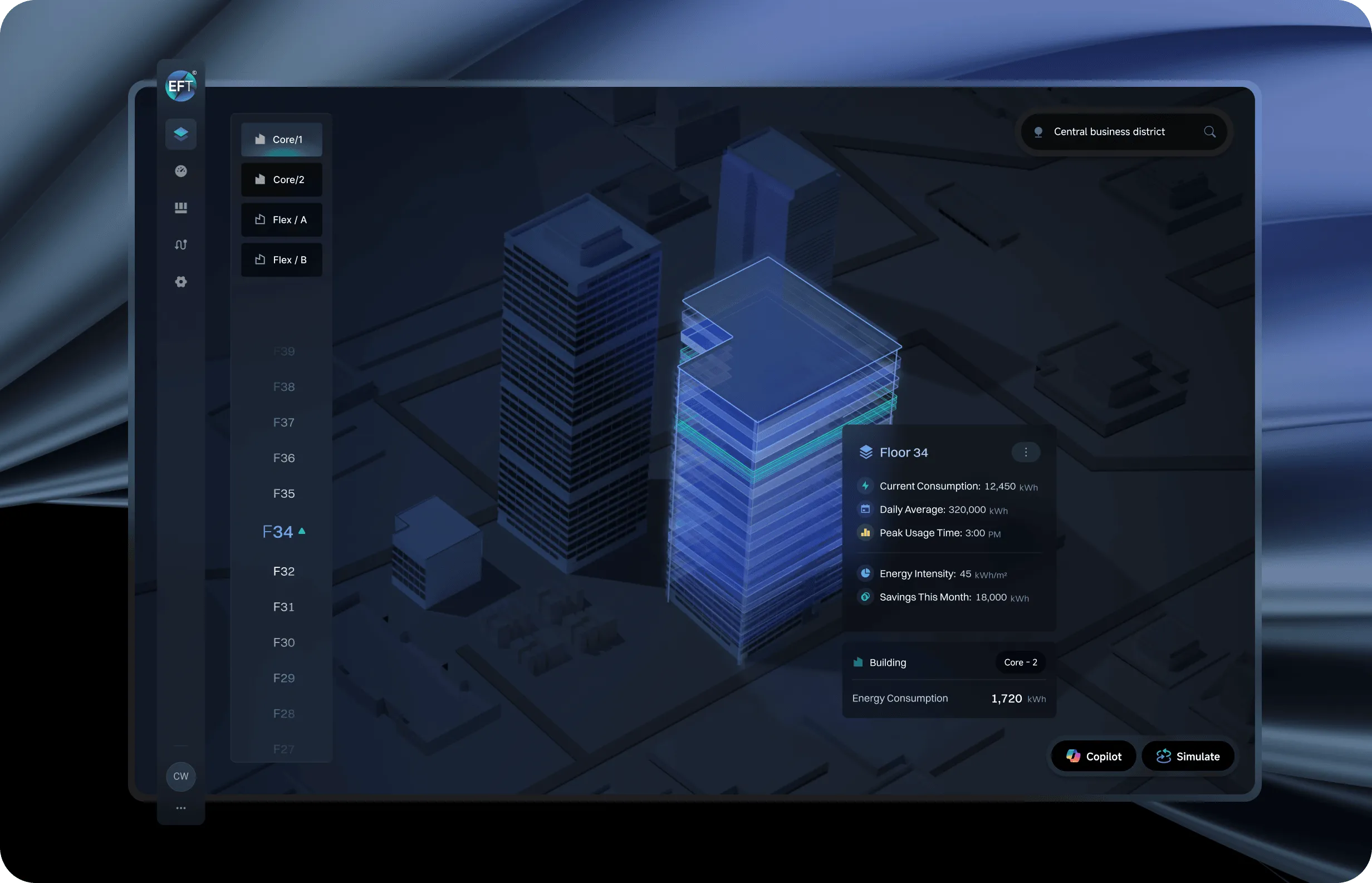
Data to Energy: A Visual Journey of Information
Transform raw energy data into valuable insights using our Data to Energy module. This feature utilizes interactive visualizations such as scatter plots, line graphs, and heat maps to decode complex datasets, enabling users to spot trends, correlations, and opportunities for energy optimization in real-time or during simulation tests for future planning.
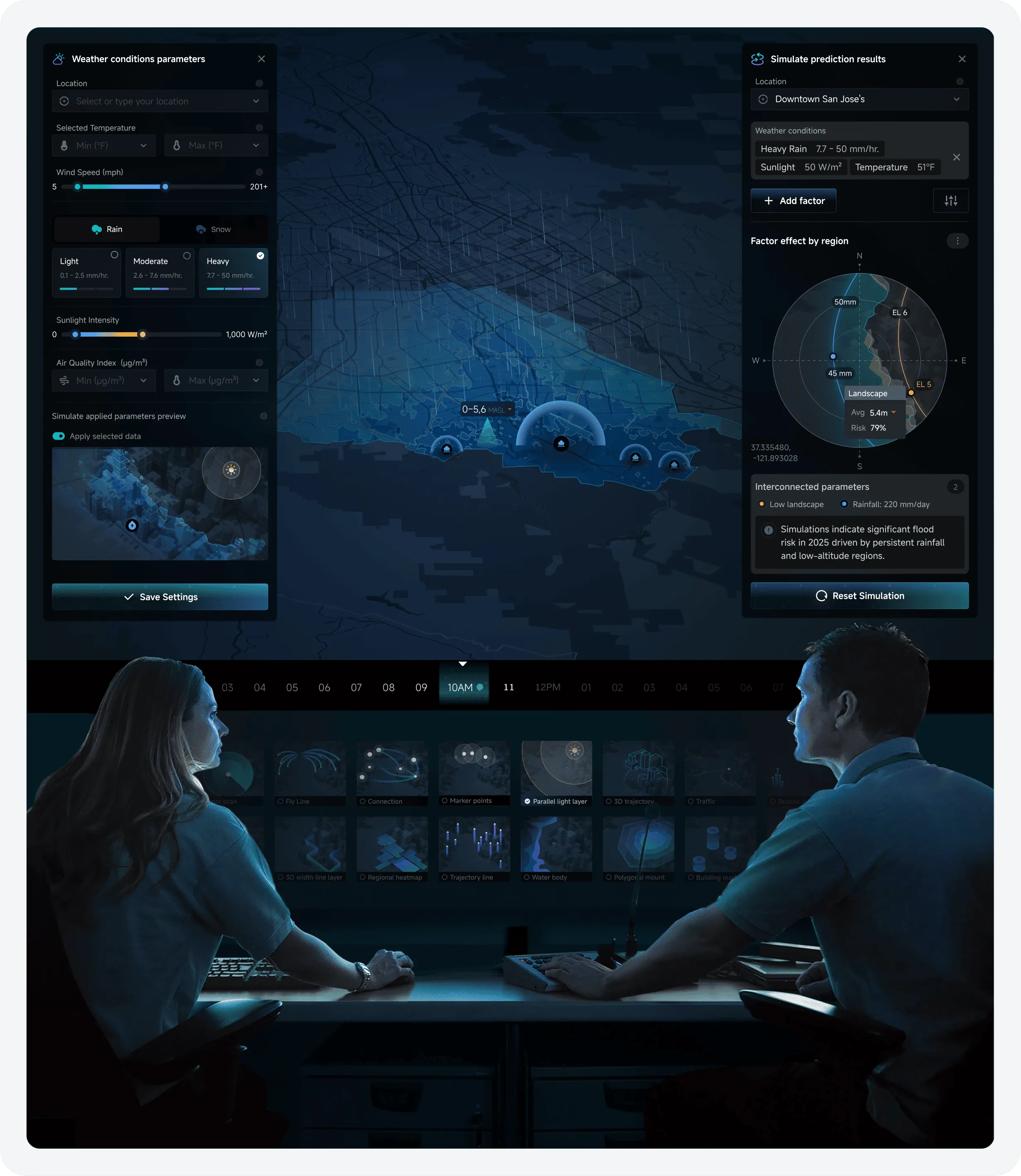
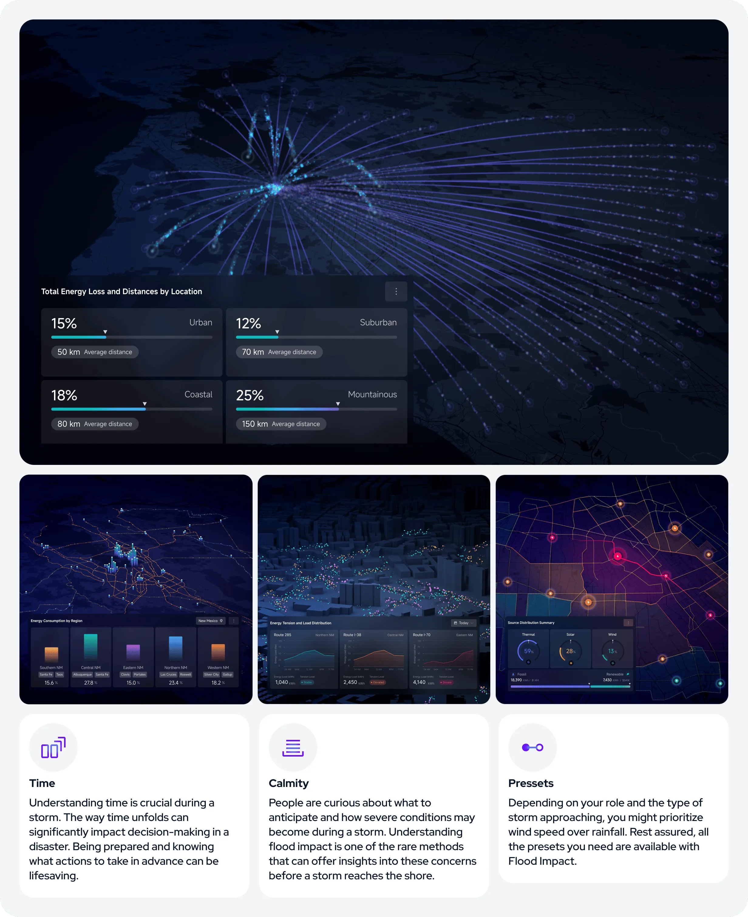
Dynamic Elements: Modeling Energy Scenarios
Getting caught in a storm is never fun. Explore how key energy factors like demand, climate, and demographics interact with Dynamic Factors. By running simulations, you can identify potential risks such as flooding in automotive and pedestrian areas, and examine scenarios that lead to smarter energy choices and sustainable planning. These insights not only help you foresee challenges but also develop adaptive strategies. This type of data visualization can save lives and contribute to a more equitable and sustainable future, both locally and globally.