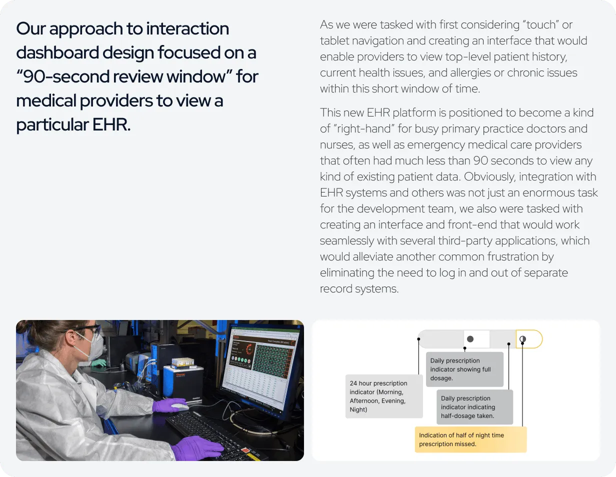
How can we optimize
existing EHR capabilities to drive greater efficiency and effectiveness?”

Business Problem Statement
We set out to create an interactive electronic health record (EHR) designed to accommodate the full spectrum of data found in existing healthcare systems. Our process began with a comprehensive audit: listing, grouping, and organizing all of the components required to ensure a system as robust and complete as possible. While our background in research and user experience workflows gave us a strong starting point, it quickly became clear that the scope of this project represented an exceptionally complex design challenge.

UX/UI Design Strategy
The design process began with initial sketches and low-fidelity wireframes, resulting in hundreds of exploratory concepts. Some wireframes focused purely on data visualization, exploring multiple approaches for representing patient health record data. Others took the form of full mock‑ups, incorporating landing screens that highlighted key elements such as high‑level patient information, critical alerts, and the most recent medical interactions or events for a given patient.
A central objective throughout this stage was to streamline the user experience by reducing the number of clicks or touches required for healthcare providers to access the information most relevant to their immediate clinical needs.


Results
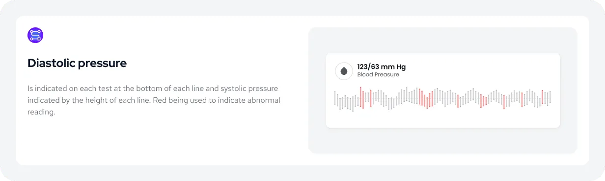
One of the most significant insights to emerge from our collaboration with the medical community was the recognition that greater data density is generally preferred. Physicians and nurses seek meaningful signals within large, complex datasets, and expressed greater confidence in their clinical decision‑making when presented with extensive information rather than distilled summaries. To accommodate this need, we developed compact yet information‑rich visualizations. For example, the blood pressure chart displays every recorded measurement over time, highlighting peak and low values, flagging abnormal readings in red, and establishing a clear baseline indicator for healthy levels across the center of the graph.
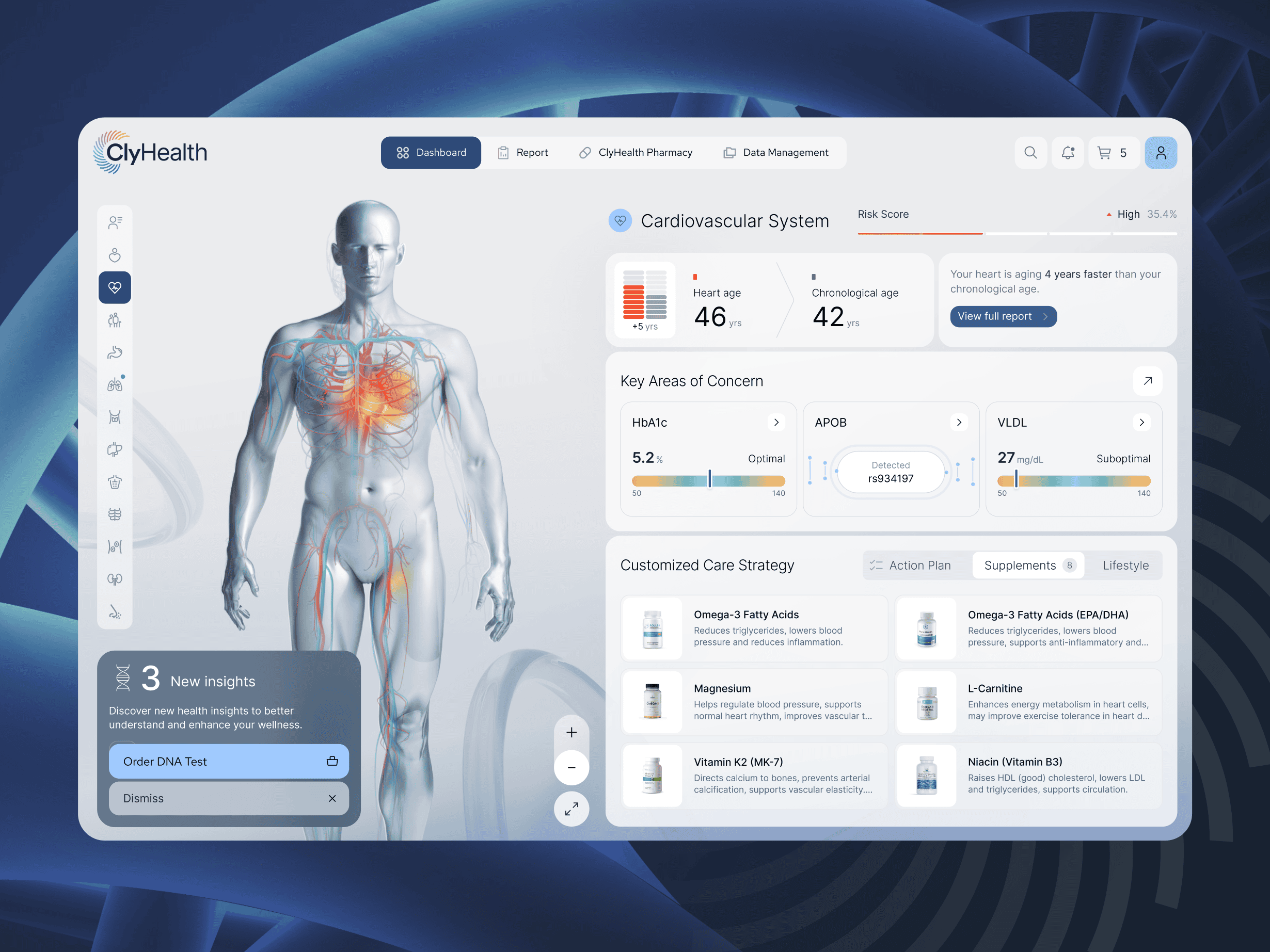
Problem Overview
The full‑body visualization provides critical care providers with an immediate overview of a patient’s problem areas, allowing them to quickly assess clinical priorities without the need to read through individual panels of information.
Notes & Graphs
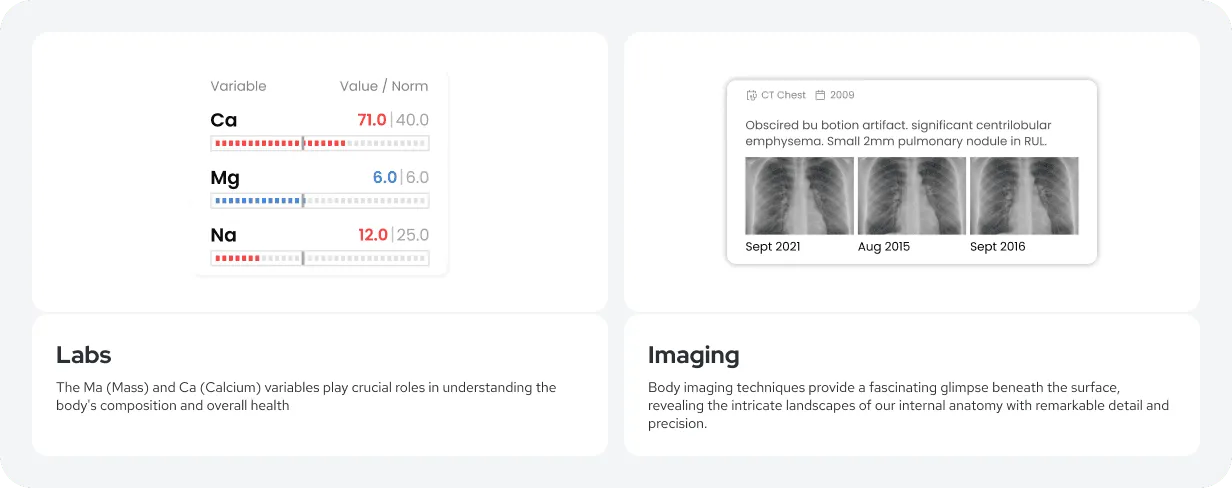
To enhance patient care, all available clinical information has been consolidated into a one‑page visual summary, with embedded links to X‑rays, MRIs, and other critical records. This summary can be filtered by date, enabling providers to view a patient’s history over time. This temporal perspective significantly increases the utility of the system, supporting both immediate clinical decision‑making and long‑term care planning.
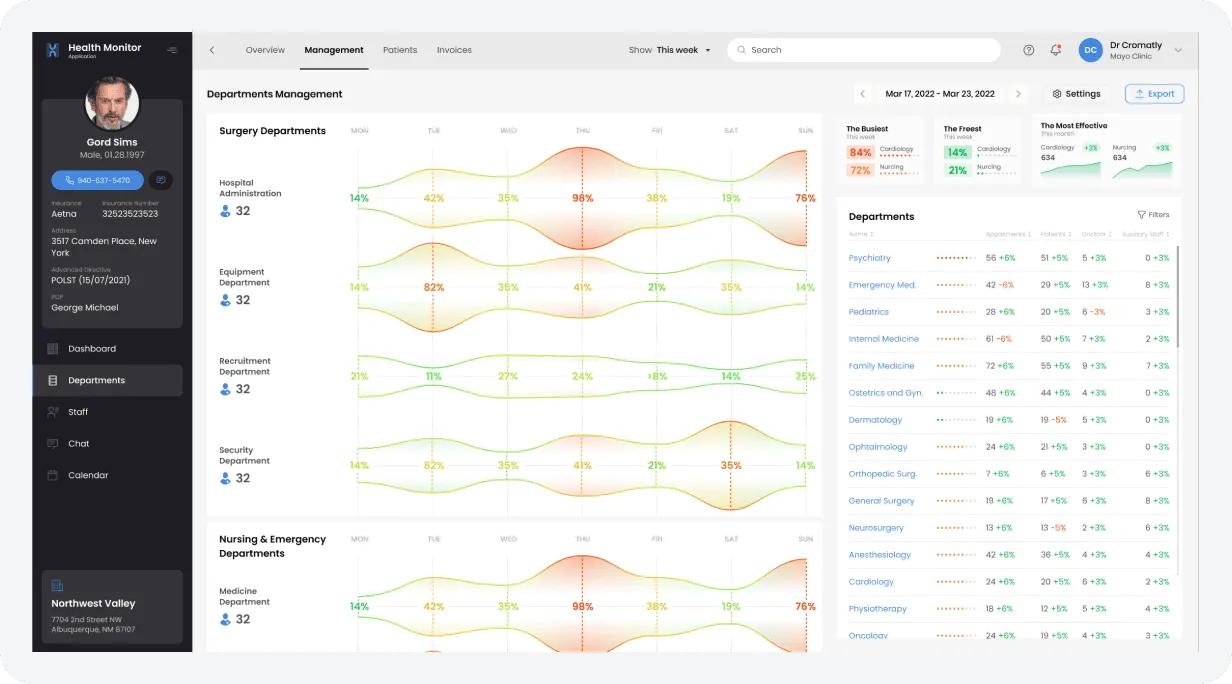
Departmental Scheduling
Scheduling has long represented a persistent challenge within the medical community, often contributing to inefficiencies and extended waiting times. To address this, the system includes an advanced scheduling interface that can be viewed and managed by department, provider, or patient, ensuring greater transparency and coordination across all levels of care.
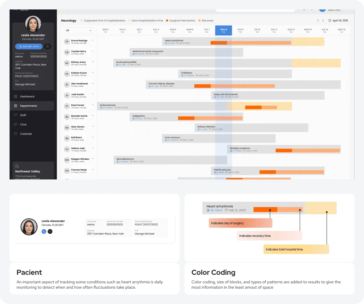
Departments / Overview
For administrative and facility management purposes, the system provides a comprehensive weekly view of all scheduled appointments across every department. This feature allows for immediate assessment of departmental capacity, enabling efficient resource allocation and operational oversight within seconds.
Departments / Management
The department-specific view offers flexible adjustments to display capacity by day, week, or month. This functionality also allows for the observation of appointment trends, indicating increases or decreases within the selected timeframes, which is crucial for strategic planning and resource management.